Brand guide · v2.8 · Personal injury · Downtown Los Angeles
IN YOUR CORNER
The People's Champ
A personal injury practice that feels like a film about the city — John walks the same blocks, talks like a person, and tells you where you stand. This guide is how the brand looks, sounds, and behaves anywhere it shows up.
One sentence, then who we're talking to and what we're against.
The promise
"Tell me what happened, in your words, and I'll tell you where you stand."
The person
Someone recently hurt in or around DTLA — in pain, behind on the mail, suspicious of lawyers, afraid of becoming "the suing type."
The enemy
Lawyer-site chrome. Navy and gold, gavels and columns, "AGGRESSIVE ADVOCACY," millions-recovered banners, committee language.
02
THE FEELING — WHY IT LOOKS LIKE THIS
Someone arriving here just had one of the worst weeks of their life. Every other injury site greets them by shouting — sirens, gavels, phone numbers in neon, MILLIONS in gold. Ours turns the volume down. That choice is the brand; everything below is downstream of it.
CALM AUTHORITY IN A LOUD CATEGORY.
What they feel in the first five seconds
Calm. The screen is quiet and dark and nothing is flashing at them. They can stop bracing.
Seriousness. Film-still restraint reads as competence. Whispering in a room full of shouters is what confidence looks like.
Not being sold. No countdown, no popup, no "millions." The belief that forms: if the site doesn't shout, maybe the lawyer won't either. Which becomes: I could tell this man what happened.
What the colors mean
Near-black — the quiet room
Warm charcoal, never corporate #000: the city at night after the noise stops. It lowers the volume on a person who has been yelled at all week — by pain, by paperwork, by adjusters. It says: you can stop bracing now.
Paper — the honest page
Warm cream, not glowing white. Words on paper — a letter, not a pitch deck. Every promise on the site sits in this color, which is exactly why the words in it are never allowed to over-promise.
Crimson — the pocket square
One drop of blood-red, worn with composure. It carries the seriousness of what happened, held under control. We spend it like it costs something: where you are, what's active, when to stop, and the question that starts everything. If crimson ever floods a screen, we've joined the shouting.
Why the rest looks the way it does
Bebas talks like the headline on a film poster — few words, said once, standing up straight. Figtree is a person talking across a desk.
The walk exists because the injury happened somewhere real — on a street, not in a stock photo. The city is a character.
John at eye level. He walks the same pavement as the reader — never posed above the skyline, never behind a desk the size of a courtroom. Dignity, not pity; a guide, not a billboard.
Hairlines and dark space instead of boxes and badges: the design trusts the reader the way the copy does.
The one test
Every new element, page, image, or sentence answers one question before it ships: does it lower the volume or raise it? Lower ships. Raise gets cut — no matter how good it looks.
03
Personality
Five traits, each with its failure mode named. When copy or design drifts, it drifts into the second word.
CALM, NOT PASSIVE
Steady voice, short sentences. Still moves fast and says hard things plainly.
DIRECT, NOT AGGRESSIVE
Straight answers, zero chest-beating. Never "fight for you" theatrics.
CINEMATIC, NOT THEATRICAL
Film-still restraint. One accent, lots of dark, no drama in the copy.
LOCAL, NOT FOLKSY
Real streets by name — Figueroa, Broadway, Bunker Hill. No "hometown lawyer" shtick.
WARM, NOT SALESY
Offers to say no ("if it's fair, I'll say it's fair"). Never urgency tricks.
04
Voice
John speaks in first person to one person. Kitchen English, max one qualifier per sentence. Compliance lives in microcopy and the footer — never mid-conversation.
The one CTA
Tell John what happened
Every primary action, sitewide. The only secondary actions are phone links. New CTA labels are new doors, and new doors make people hesitate.
Banned above the footer
negligenceliabilitydamageslitigationcontingencystatutecounselretaincompensationclaimantplaintiffcase evaluationlegal team
Say it in kitchen English instead: "unless you get paid," "a courtroom fight," "deadlines."
Sound like this, not that
Not that
We aggressively pursue maximum compensation for accident victims.
This
If the money on the table is fair, I'll say it's fair. If it's not, I'll show you why.
Not that
Submit your case evaluation and our legal team will respond promptly.
This
Tell me what happened, in your words. I'll tell you where you stand.
Not that
Delay may prejudice your claim; statutory deadlines apply.
This
Deadlines are real. Let's check today instead of guessing.
Claims discipline
Anything unverified ships in [brackets] or not at all. Never invent results, fees, testimonials, or credentials.
No outcome guarantees, no "specialist" claims, and every dramatized scene carries its label: "Dramatization. Not a depiction of any client or result."
05
Wordmark
The wordmark is type, not a drawn logo: Bebas Neue, tracking 0.04em, paper on near-black. Display use takes the period; nav and labels drop it.
IN YOUR CORNER
Clear space: at least one cap-height on all sides (dashed line shown). Minimum size: 16px cap height.
The full lockup
IN YOUR CORNER
The People's Champ
Two lines, two jobs: the wordmark is the relationship, the champ line is the man. Together with the CTA they form the brand sentence: In your corner. Tell John what happened.
The corner stop closes the wordmark — always. IN YOUR CORNER never ends in a round period; it ends in the crimson corner glyph, sized to the type's period. One drop of crimson, always at the full stop.
Scale: tagline ≈ 40% of the name's size, wider tracking (.06em). THE PEOPLE'S CHAMP is a caps label — muted, .24em tracking, no period (it's a title, not a sentence), never larger than the tagline's half.
Naming hierarchy (2026-08-28):JOHN STENSON LAW⌐ is the firm name — the nav identity, set as type alone and closed by the corner stop. No mark beside it, no round period; the Corner mark lives on its own (favicon, avatars, stamps, the call bar), never paired with the name. IN YOUR CORNER is the wordmark and only brand line — headlines, mastheads, covers, merch. The former place line is retired; community sublines say it plainly ("With you, all over Los Angeles.") without becoming a second wordmark.
Tiers: hero = IN YOUR CORNER⌐ + community subline + champ label; OG/print covers = the same stack with the firm name in the eyebrow; site nav = JOHN STENSON LAW⌐ (type only); IN YOUR CORNER⌐ alone under the mark for avatars, signatures, merch.
The corner stop is a punctuation glyph, not the mark: it closes the IN YOUR CORNER wordmark wherever it appears (nav, mastheads, heroes), always crimson, sized to the wordmark's period. The standalone Corner mark keeps its upper-right orientation — never rotated.
"The People's Champ" is John's real moniker — it rides as a subtitle, never as a claim in body copy, and gets one counsel glance before real-practice launch.
The mark — the Corner
IN YOUR CORNER
Why the Corner is the mark
It says "in your corner." The people's-champ promise in champ language, not law language. John is known as the people's champ — and the champ's corner is where someone stands behind you between rounds. The whole client relationship in one glyph.
It's a street corner. The corner you were standing on, drawn in two strokes. Corners are where the walk's beats actually happen: the light you had, the sidewalk that wasn't fixed, the way to the car.
It's the corner of a film frame. A crop mark — the same cinema grammar as the rest of the brand. Every page already looks like a film still; the mark is the corner of that frame.
It stages the promise. The crimson square is the pocket square — the person, the seriousness, worn with composure — sheltered by the paper angle but open on two sides. Backed, never boxed in. Protection without a cage.
It passes the volume test. Two bars and a square: whisper-quiet, unmistakable at 16px, reproducible in embroidery, a rubber stamp, or chalk on a sidewalk. And deliberately not a crown — the people's champ stands at the corner with the people, eye level, never above them.
Mark rules
The angle always opens upper-right — forward and up. Never rotated, never mirrored.
The square is always crimson; the angle never is. In print the angle may go ink-on-paper; the square stays crimson.
Clear space ≥ the square's width on all sides. Minimum size 16px. Favicon and avatars: the mark on the near-black rounded field.
Never outline it, never close it into a full frame, never add a second square, never trap the square — it stays open on two sides.
Never
Never set the full wordmark in crimson — the period (or one square) carries the accent.
No gradients, outlines, drop shadows, fake bold, or italics. Bebas has one weight; that's the point.
Never pair with justice clichés — scales, gavels, columns, laurels.
Never gold, never navy, never on a photo without a dark scrim behind it.
06
Color
Warm near-black city, paper type, one crimson accent — the pocket square. Click a swatch to copy its hex.
bg
#0B0A09
The ground. Dominates every screen.
surface
#151311
Cards, bars, form fields.
elevated
#1C1916
Raised elements, hover states.
border
#2C2824
Hairlines everywhere. 1px only.
paper
#F3EEE6
Type and primary buttons (with ink text).
muted
#9A9188
Secondary text. The body floor — passes contrast.
subtle
#6F6860
Hairline labels ≥18px only. Never body text.
crimson
#C81E3A
The pocket square. Progress, active tick, errors.
Usage ratio
Crimson is scarce by law: roughly 2% of any screen. If two crimson elements are visible at once, one is wrong (pocket square in imagery doesn't count).
Never crimson backgrounds, never crimson paragraphs, never gold anywhere. One exception (Scott, 2026-08-28): the floating call bar's Tell John button is crimson fill + white text — the single crimson surface, reserved for the one action that matters.
Buttons: paper fill + ink type (primary), hairline border + transparent (secondary).
Two themes, one source of truth
Dark is the brand's home — the quiet room, the film still. Light is paper mode: the same room with the blinds open, for daylight reading and print-adjacent surfaces. Every token lives in one file — /theme/tokens.css — and every surface (site, this guide, the audit, the CMS) consumes it. No page defines its own colors. The toggle in the masthead switches this page right now; the choice follows you across every surface.
Light values: ground #F3EEE6, surfaces step darker (#ECE5D9, #E2D9CA) — warm paper, never white cards. Text ink #171310, body soft #4E4740, crimson deepens to #B4182F for contrast. Same scarcity laws in both themes.
Photography stays cinematic. The walk, the plates, and anything over imagery carries .dark-island and keeps the dark palette in light mode — like a film playing in a bright room.
The toggle is the corner-stop glyph + the mode it offers (.theme-toggle), one per masthead. Choice persists (jsl-theme) and ?theme=light deep-links a mode.
07
Type
Two families, strict jobs. Bebas Neue for display — one weight, all caps, tracking 0.04em. Figtree for everything people actually read.
The reading layer
Body copy is soft ink, not paper. Paragraphs, list bodies, and table cells read in #C9C1B5 (token --soft) — warm, quiet, easy on the eyes. Full paper #F3EEE6 is reserved for headlines, bold lead-ins, and the one phrase a sentence exists to say.
Emphasis is color first, weight second. A bold lead-in ("Calm.") goes paper 600 and becomes the scan anchor; the sentence behind it stays soft 400. Never more than one bold phrase per paragraph — two bolds in a sentence means neither is the point.
The glaze test: squint at any screen — you should see a few bright anchors on a quiet field, not a wall of white. If everything glows, nothing reads.
Display / Bebas Neue · headlines only, never below 20px
THE WALK ENDS HERE.
Display 40 · section heads, card titles
CAR ACCIDENTS
Body 18 / Figtree 400 · lede & body
You didn't plan for this. A drive you've made a hundred times. A sidewalk. A normal Tuesday.
Body 16 / Figtree 400–500 · UI, forms, cards
Tell me what happened, in your words, and I'll tell you where you stand.
Never fake-bold or italicize Bebas. Never set paragraphs in it.
Spanish renders in both faces — ¿ ¡ ñ and accents are present in Bebas Neue and Figtree, so the /es/ pages use the identical system.
CJK extension (日本語 · 한국어 · 中文): Bebas has no CJK glyphs, so those pages use Noto Sans JP/KR/SC — weight 900 for display heads (normal tracking; wide tracking breaks CJK, and sizes drop ~20% for density), 400/500 for body, with Figtree retained for Latin/numbers. The wordmark, stat numerals, and all Latin brand elements stay Bebas.
Body line-height 1.6; display line-height ≤1. Sentence case for body, caps only for display and labels.
No third typeface, ever. No emoji.
08
John — subject lock
One man, locked. Every derived image starts from the studio portrait. Do not invent a different John.
Public editorial derivative. The source portrait stays private in the repo.
Always facing the camera. Front or slight 3/4. Never a profile walker.
Hands in pockets, always. That is his walk. No arm swing.
Every component the site is allowed to use — live, in real states. Built to cover every page and template in docs/SITE_PLAN.md: the walk homepage, 11 money pages, 6 corridors, 6 comparisons, 9 California guides, the trust and legal pages, and the /es/ subset — ~48 URLs on 7 templates. Kit-first rule: if a screen needs something that isn't on this page, add it here first, then build it.
Primary — paper fill, ink type. One per view, and it always says the CTA.
Secondary — hairline border, transparent. Never two primaries side by side.
Phone numbers are underlined text with real tel: hrefs. Everything ≥48px tall; focus is a 2px paper outline, always visible.
Theme toggle
One per masthead, far right. Corner-stop glyph + the mode it offers. Switching persists across every surface (jsl-theme); it flips this page live. Spec: /theme/tokens.css + /theme/theme.js.
Trust chips
[Free call][No fee unless you get paid][You talk to John, not a call center]
Quiet hairline pills under the hero CTAs. Brackets come off when the claim is verified — the chip ships only if true.
Fixed to the bottom, visible the entire visit (Scott, 2026-08-28), never covers the walk's case card. Two actions only — no mark, no logo. The Tell John button here is crimson with white text: the one crimson surface in the system, because it is the one action the whole site exists for. This is the highest-value component on the site — most clients call.
Lives in the nav wherever real language twins exist (never machine-translate). Native details pill — works without JS, links carry the switch, crimson tick marks the active language, outside click closes it. Live in five languages on the Sweet James article: English · Español · 日本語 · 한국어 · 中文.
The form
Exactly three visible fields. Every extra field is an exit ramp.
Labels always visible — never placeholder-only.
autocomplete + inputmode="tel" so a phone fills it in one tap.
Errors are crimson kitchen English that name the fix — shown on the Phone field here.
One hidden honeypot field (company), ignored client-side.
Microcopy is muted 13px — the only compliance allowed near the form.
Contact adds one after-hours expectation line: `[After hours? Leave it — John calls back next morning.]`
Success routes to a tracked /thanks URL so every form lead has a source.
Dramatization. Not a depiction of any client or result.
Anatomy (v2, 2026-08-28): place + beat index (02 / 07) → scene name → the human line (paper, 500) → two-to-three recognition rows in John's voice (the nod mechanic — hyper-specific, corner-tick markers) → quiet "Tell John what happened →" → dramatization behind a hairline. Corner stop notches the card top-right. Content staggers in as the beat arrives (60–480 ms, transforms only, off under reduced motion).
Translucent surface (≈88% + blur) — the plate must read through it.
Place eyebrow → Bebas title → beat line → dramatization label. Nothing else.
Right-center on desktop, top on mobile; never overlaps John. 200ms crossfade between beats.
Proof cards
Review · [Verified client, with permission]
"[Client quote in their own words.]"
— [First name], [case type]
Reviews describe individual experiences. They don't promise your result.
[Case type] · [Year]
[$ RESULT]
[One sentence: what the case was and what John did.]
Past results don't guarantee or predict your result.
Proof ships only verified — the disclaimer is welded to the card, not the page. No verified items yet means the Reviews/Results pages don't exist yet. Never faked.
Bio blocks
JOHN [LAST NAME]
Personal injury · Downtown Los Angeles · [CA Bar #]
[NAME]
[Role] · [One human line]
About uses the full framed portrait + bio prose; Team uses these cards. Bar number and credentials are slots until verified.
One card pattern for related money pages, guides, and corridors — the eyebrow tells you which. Bebas title, one-line kitchen-English description, whole card is the link.
Progress & ticker
3px crimson bar at the top of the stage; 7 dots, active dot crimson — the only persistent crimson on screen.
Dots are buttons: ≥44px hit area, labeled ("Car accidents — 2 of 7"), and they scroll to their beat.
Replaces the form in place. Display type for the relief, bracketed promise only if verified, signed, phone as backup. The /thanks page adds the numbered steps ("what happens next").
The consult modal
Every Tell John what happened CTA opens one modal — title WHAT HAPPENED? with a crimson question mark, the three-field form, and the success state in place. Live on /streets.
Native dialog: Esc, backdrop click, and a 44px × all dismiss; focus returns to the opener; page scroll locks while open; browsers without dialog fall back to the consult anchor.
Surface panel, hairline border, lg radius, blurred near-black backdrop. The consult section keeps its closing headline and phone — the modal carries the form.
Interior page hero
Downtown Los Angeles ▸ Car accidents
Money pageSe habla español
HIT BY A CAR ON FIGUEROA.
The 110 does not care that you had the green. Here's what to do right now — and what I'd do next.
Every interior page (money, corridor, comparison, guide, trust) opens with this: breadcrumb, tags, Bebas h1, one lede, the CTA row. No plates required — surface ground is enough.
Prose & links
WHAT THE OTHER SIDE ALREADY KNOWS
The insurance company has seen a thousand crashes like yours. That's exactly why the first offer comes fast — speed works for them, not for you.
Their adjuster's job is to close your file cheap.
Your job is to get better. Those aren't the same job.
Measure 68ch, body 16–18px. Inline links are underlined paper with 4px offset — no crimson links, no bare URLs. Section heads inside prose are Bebas 34.
Recognition list
The adjuster called before you even got home.
The other driver's story changed overnight.
Your neck didn't hurt until the next morning.
Large quiet lines, hairline-separated — never bullet chips. Home uses the master list; each money page localizes three of its own.
Numbered steps
You talk, I listen. What happened, what hurts, what's changed since.
I tell you where you stand. Plain words, same call.
I take it from there. The calls, the paperwork, the insurance company — off your plate.
Crimson Bebas counters. Used for "how it works," the /thanks page, and any first/next/then sequence.
Checklist
Photos of everything — cars, street, signals, your injuries.
Names, numbers, and insurance cards.
A doctor today, even if you feel okay.
Nothing signed, nothing recorded, until we talk.
Empty squares, not checkmarks — it's the reader's list to do, not ours to brag about. Money pages and guides.
Callout
Don't sign anything yet. Let me read it first. If it's fair, I'll say it's fair — and you lost nothing by checking.
The only crimson-marked text block. One per page, maximum — it's the "stop" moment.
Q&A + disclosure
"Do I even have a case?"
That's the call. Fifteen minutes, your words, straight answer.
"I don't want to sue anybody."
Most of this work is dealing with an insurance company, not dragging a person into court. Nothing gets filed without your say-so.
Do I have to talk to their insurance company?
You don't have to, and you probably shouldn't yet. Tell them your lawyer will call back — then tell me what happened.
Open Q&A pairs for the important questions; disclosures for long FAQ tails on interior pages only — never the home straight-answers.
Comparison table
John — local
National firm
Who answers
[John, directly]
A call center
Where they work
These streets
Wherever the ads run
Your case is
One of a few
One of thousands
Scrolls inside its own container on small screens. Comparison copy naming a real firm is counsel-reviewed before publish; claims about John stay bracketed until verified.
Article: meta line + the short version
Guide6 min readUpdated August 2026[Reviewed by John]
THE SHORT VERSION.
California gives most injury cases two years from the day it happened.
A case against a city or the state can be six months. That one surprises people.
Evidence disappears long before any deadline does. Move sooner than you think you need to.
Every article opens with these two. Three bullets max — if the reader stops here, they still got the answer. Crimson left edge marks it as the article's one summary box.
Article: pull quote + stat tiles
TWO YEARS SOUNDS LIKE FOREVER. IT ISN'T.
2 YRS
Most California injury cases
6 MO
[Cases against a city or the state]
DAYS
How long some camera footage lasts
One pull quote per article — it re-hooks the scanner mid-scroll. Bebas, crimson left rule, ≤10 words.
Stat tiles: Bebas number, kitchen-English label. Every number is public fact or stays [bracketed]. Never invent one.
Article: timeline
DAY ONE
Photos of everything. A doctor today, even if you feel okay. Sign nothing.
THE FIRST WEEKS
The adjuster calls, friendly and fast. You don't owe them a recorded statement.
MONTH ONE & TWO
Treatment gets documented. This is what your case is built from.
THE DEADLINE
Two years for most cases — six months if a government is involved. After that, it's over.
For anything that unfolds over time — the process, a claim's life, a recovery arc. Crimson ticks, Bebas moments, one muted line each. Nobody reads a paragraph version of this.
Article: do / don't
DO
See a doctor today, even if you feel fine.
Photograph the cars, the street, the signals, your injuries.
Save every bill and letter in one folder.
DON'T
Give a recorded statement yet.
Sign anything — or post about it anywhere.
Wait to "see how it feels" for a month.
Paired, always. The DON'T title is the kit's crimson exception — it's a stop signal. Three items max per side.
Article: plain words (the translator)
In plain words
"Statute of limitations" — the legal deadline to start your case. Miss it and the case is over, no matter how strong it was.
The one sanctioned home for legal vocabulary. Search needs the real term; the reader needs the translation. A term enters the article here — translated immediately — before it may appear anywhere else.
Once introduced in the box, the term may be reused in that article where the plain phrase would get clumsy (liens, for instance, come up repeatedly in settlement content). The box is its definition of record. One box per section, and it may hold that section's terms together.
This keeps the banned-words rule workable on guides that must rank for the term.
Article: sources & fairness
Sources · as of August 2026
The firm's own published materials — results, team size, service claims.
Better Business Bureau profile — complaint counts, complaint and response texts.
Public review platforms — quoted reviews attributed by year.
State Bar of California attorney profile — license status.
Complaints and reviews are individual accounts, not judicial findings; several noted here were resolved. Details change — verify against the live sources before relying on them.
Required on every article that states facts about a real firm or person — comparisons especially. Numbered source list, an as-of date, and the allegations-not-findings line welded on.
Facts in the body stay attributed in-line ("its website says," "per its BBB profile") — the block is the ledger, not a substitute for attribution.
Comparison gate: any article naming a real firm is counsel-reviewed before it ships on the real practice site. On the demo it rides noindexed with this block visible.
Article: scenario card
SAY THIS HAPPENS.
You're rear-ended on Figueroa in March. You feel fine, so you skip the doctor. In November your shoulder won't lift. The deadline didn't move while you waited — and now the other side gets to ask why you never saw anyone.
Dramatization. Not a depiction of any client or result.
One concrete story beats three paragraphs of explanation. Dashed frame = hypothetical; the dramatization label is welded on.
Article: highlight, divider, figure
Body copy carries one marked sentence per section, maximum: the deadline doesn't care how strong your case is. That's the line a scanner leaves with.
Figueroa corridor, morning rush. Dramatization.
Highlight: crimson underpaint on ≤1 sentence per section. More than that and nothing is highlighted.
Street divider: hairline + one crimson square — the breathing point between major turns in the article.
Figures reuse the painterly plates, hairline-framed, with a muted caption; dramatized scenes keep their label.
Article: inline action band
Not sure which deadline is yours? That's a two-minute question.
The mid-article converter: one line + the CTA (opens the WHAT HAPPENED? modal). Max two per article — after the first big answer, and near the end. Never interrupts a component.
Guides with 4+ sections get one — sticky beside the prose on desktop, collapsed above it on mobile. Active section carries the crimson edge. Section names are answers, not topics.
Article: anatomy + writing rules
Assembly order: interior hero → meta line → THE SHORT VERSION → prose in sections (timeline / do-don't / stats / scenario / plain-words where they earn it) → first action band after the first big answer → Q&A → second action band or consult band → pager → footer. Sticky call bar on mobile throughout.
Front-load every section: the answer is the first sentence under each head; explanation follows for whoever wants it.
Paragraphs ≤4 lines, one idea each. A Bebas subhead every ~200 words. Three or more items = a list or component, never prose.
The bold spine: read only the bolded phrases top to bottom — they must summarize the article on their own.
Subheads are answers ("Six months if a city is involved"), not labels ("Government claims").
Every number is public fact or [bracketed]. Every hypothetical carries the dramatization label. Voice rules from §3 apply — first person, kitchen English, one CTA.
Office / NAP block
[Law Offices of John — full firm name] [Street address] · Downtown Los Angeles (213) 410-1900 [Hours] · [After hours? Leave it — John calls back next morning.]
One version of the truth: name, address, phone, hours identical on every page, the footer, and the Google profile. This block is the reference.
Guides only — keeps readers inside the guide sequence instead of bouncing.
Footer
Attorney advertising. Scenes are dramatizations and do not depict actual clients, accidents, or results. Past results do not guarantee similar outcomes. This is not legal advice.
Where all compliance lives. The slots stay visible until verified — never faked, never deleted.
404
WRONG TURN.
This street doesn't exist. The walk starts back at the top — or just tell me what happened.
Surfaces & radius
sm 8
md 12
lg 20
xl 28
md 12 for cards, inputs, and buttons; lg 20 for form shells; xl 28 for hero-scale frames; sm 8 for small elements.
Dividers are 1px border hairlines — no other weight, no double borders, no shadows except the portrait lift.
12
Applications
How the brand lands off the homepage. The site itself follows docs/BUILD_PROMPT.md — that spec is law.
Share card (OG 1200×630)
IN YOUR CORNER
John cutout left, DTLA dusk behind, firm name as eyebrow, IN YOUR CORNER with the corner stop, place subline below. No phone numbers.
Email signature
John In Your Corner — Personal injury, Downtown Los Angeles (213) 410-1900 · [site]
Text only. No logo images, no inspirational quotes, no crests.
Social & one-pagers
One plate + one beat line + the CTA. Never more than one crimson element.
Print may invert: ink type on paper ground. Crimson stays scarce.
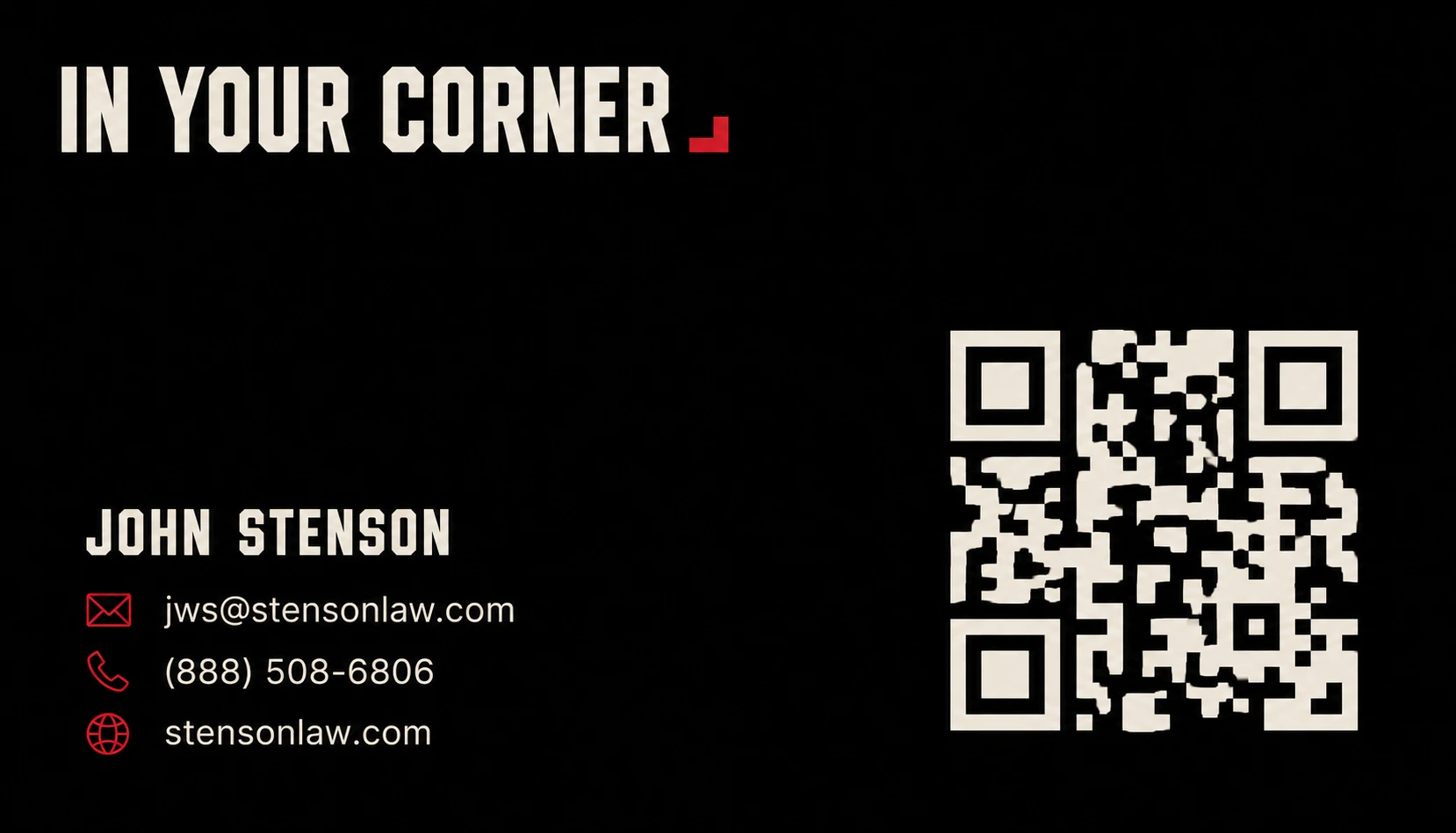
Business card — front (3.5″ × 2″)
The approved front artwork, 2026-08-28. Ink ground, the wordmark with its corner stop up top, name + three contact rows bottom-left with crimson line icons, cream QR at right. The crimson family (corner stop + icons) is the only color.
QR points to the site with ?src=card so walk-up scans are countable. Never a raw URL shortener.
The phone on the card is the one canonical tracked line — currently the (888) number; see the audit's phone memo before any reprint.
Back: plain ink field, the Corner mark centered small in paper + crimson. Nothing else.
Print: 3.5″ × 2″, thick uncoated black stock, no gloss. Paper ink prints as spot cream where possible.
13
Housekeeping
What
Where
Deep build spec (v3 — mechanics, copy deck, failure modes)
docs/BUILD_PROMPT.md
This guide (agent/designer text version)
docs/BRAND.md
Living UI kit (components + states)
/brand#kit
Site plan — every page, template, and kit-coverage matrix
docs/SITE_PLAN.md
Source portrait (private, never deployed)
assets/
Public editorial portrait derivative
audit/john-editorial.png
Changes
Scott approves. Receipts in docs/LEDGER.md.
Placeholders
Phone, Bar #, address, and every [bracketed] claim stay visibly unverified until confirmed — never faked.